
In 2013, the Jacksonville Jaguars introduced a new uniform set featuring a bizarre two-tone helmet, which many of us promptly called the worst helmet design in NFL history.
Five years later, sweet relief is finally at hand as the Jags are getting set to unveil a new uniform, including a new helmet, sometime in April. (The exact date has not yet been announced.) With that in mind, we recently asked Uni Watch readers how they would redesign the team's look. Here are the best and most interesting entries we received (for each image, you can click to enlarge):
Best Overall Design: Trevor Tierney
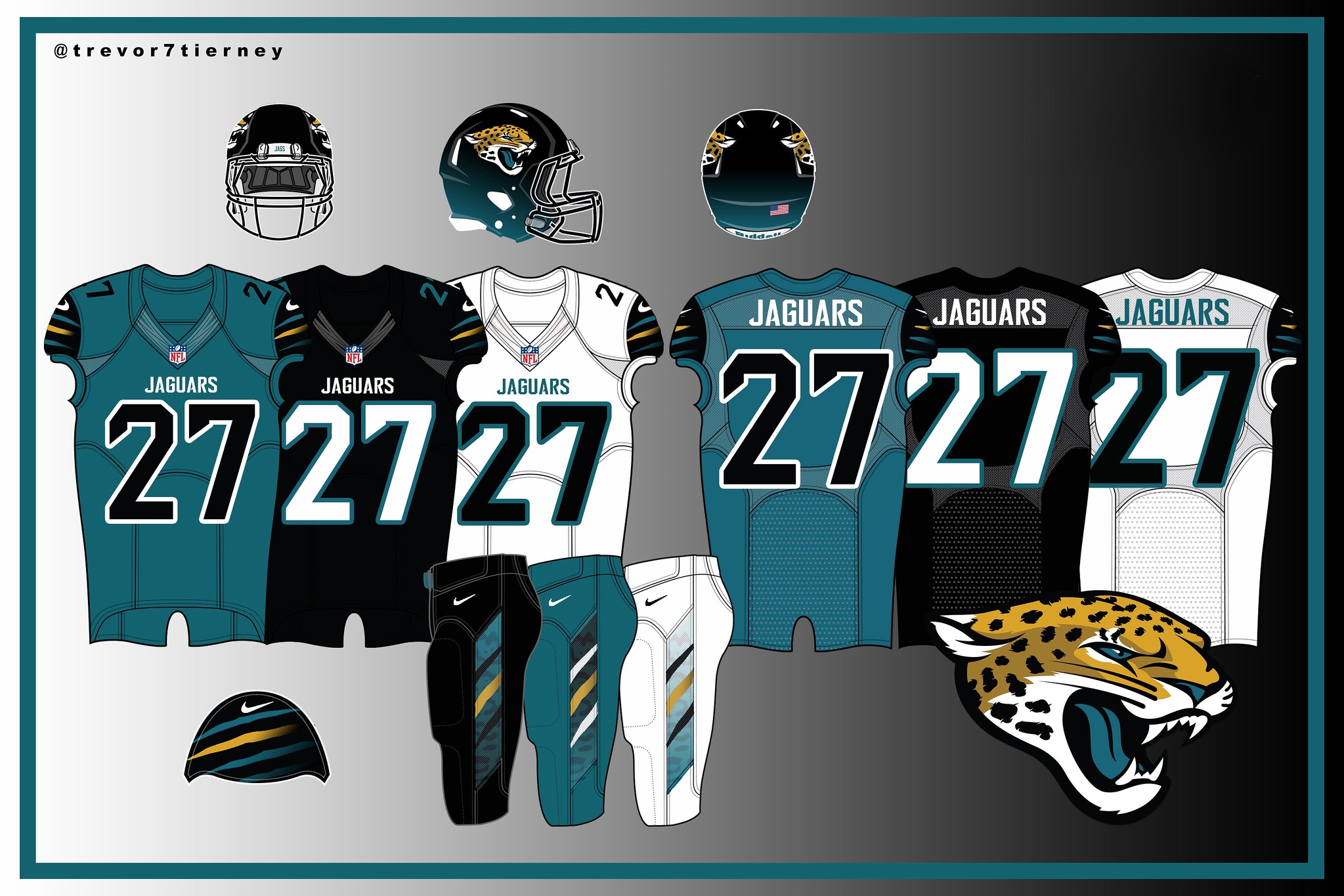
Small design elements can sometimes resonate in a big way. That's the case with Tierney's entry, which features unusual striping on the sleeves and the pants. In both cases, the gold stripe in the center pops just enough to provide some warmth throughout the design. A modern-looking uniform set that somehow feels a bit traditional -- a nifty trick. Well done.
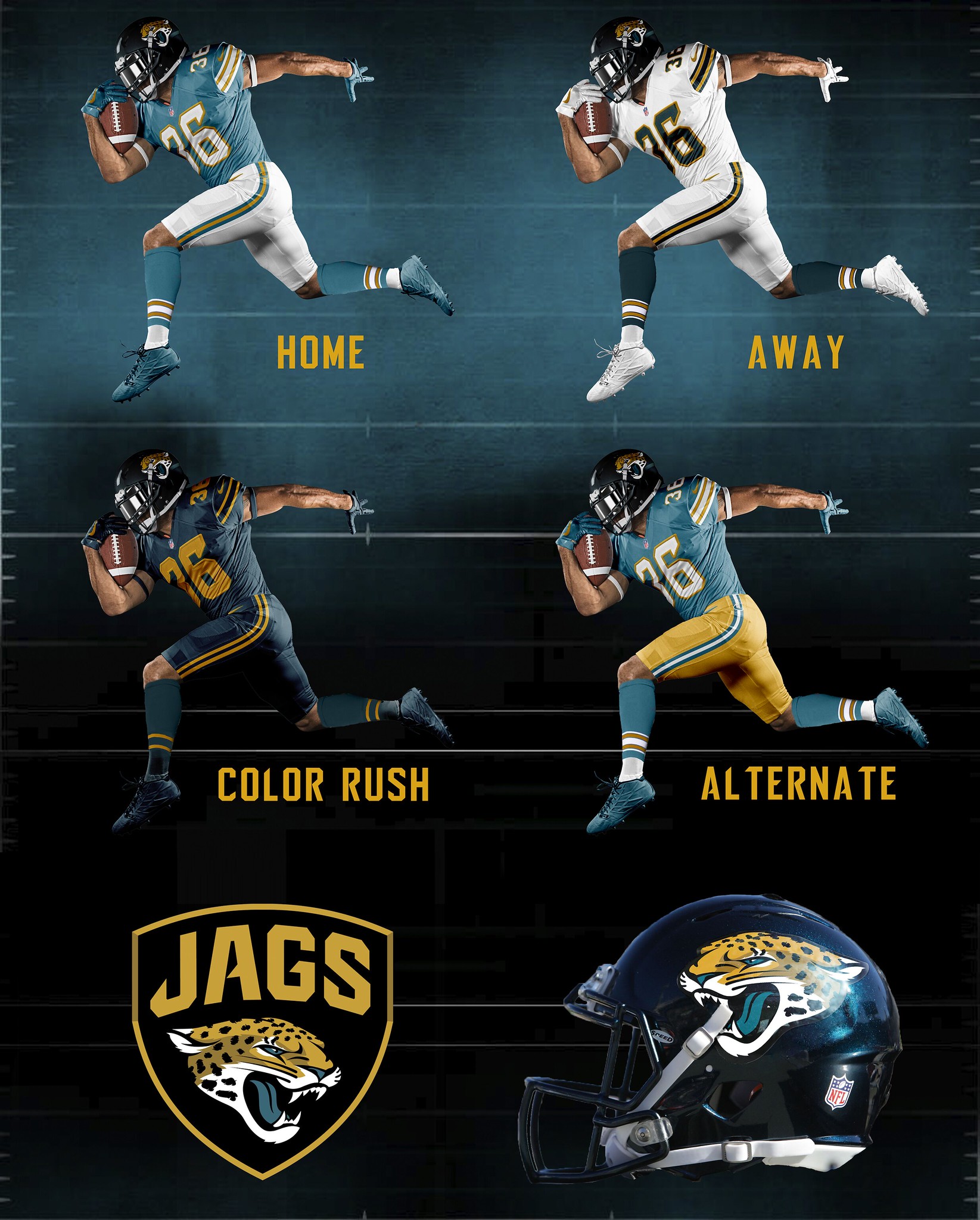
Best Use of Jaguar Fur Pattern: Nick Tringale
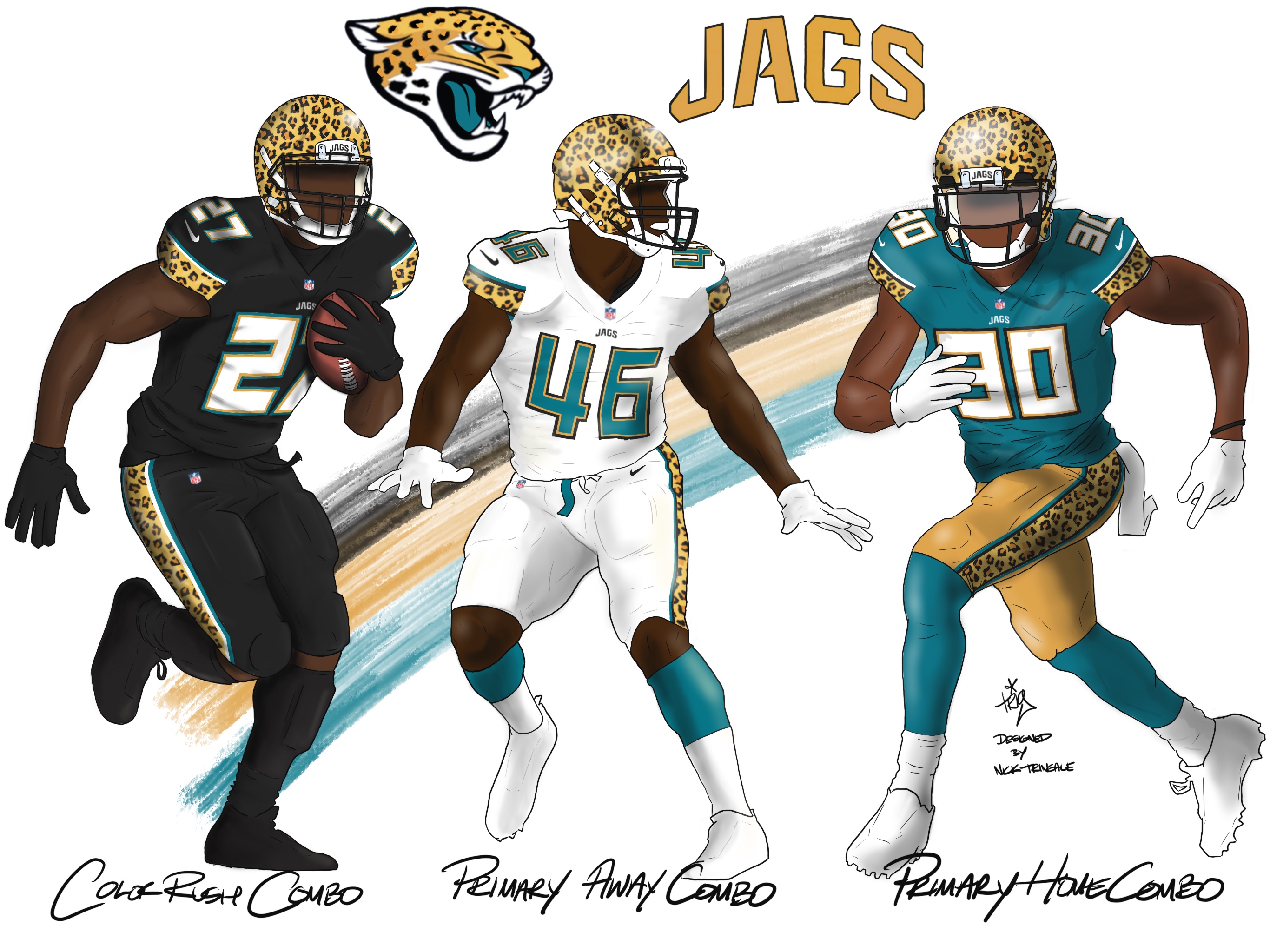
Many readers included some sort of spotted jaguar print pattern in their designs. Tringale did this the most successfully, incorporating the pattern into his helmet, jerseys and pants (plus he came up with an attractive presentation format, which always helps). The visual effect is sort of like what the Bengals have been doing, but with the spotted pattern instead of stripes. (Robert Twomey came up with something similar, but with more sedate pants striping and eyeballs on the helmet.)
Best Use of Claw Marks: Isaiah Moss
Several readers included some sort of slash marks, as if torn by a jaguar's claws, in their designs. Most of them put the slash marks on the sleeves, but Moss took the more interesting approach of putting them on the shoulders. Sure, it's a little XFL-ish, but it works surprisingly well.
Best New Helmet Logo: Dan Kennedy
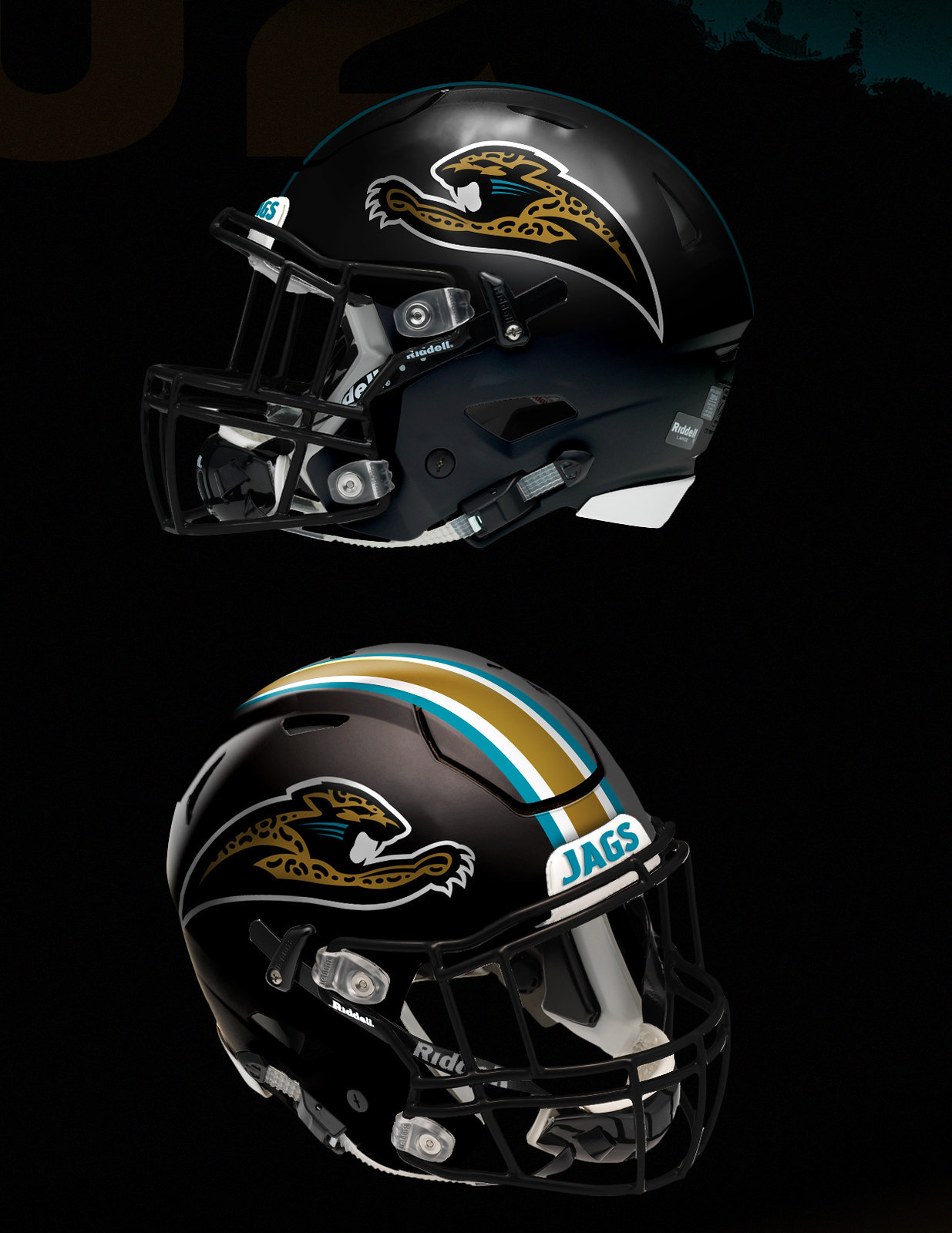
Most of our entrants chose to stick with the Jags' current helmet logo. But Kennedy did something clever: He went back to the original "leaping jag" logo that was supposed to appear on the team's helmets in the 1990s (which was scrapped after the automaker Jaguar threatened legal action) and modified it into a more streamlined, truncated version. Not bad! Looks good as a midfield logo, too.
Best Incremental Changes: Jon Nguyen
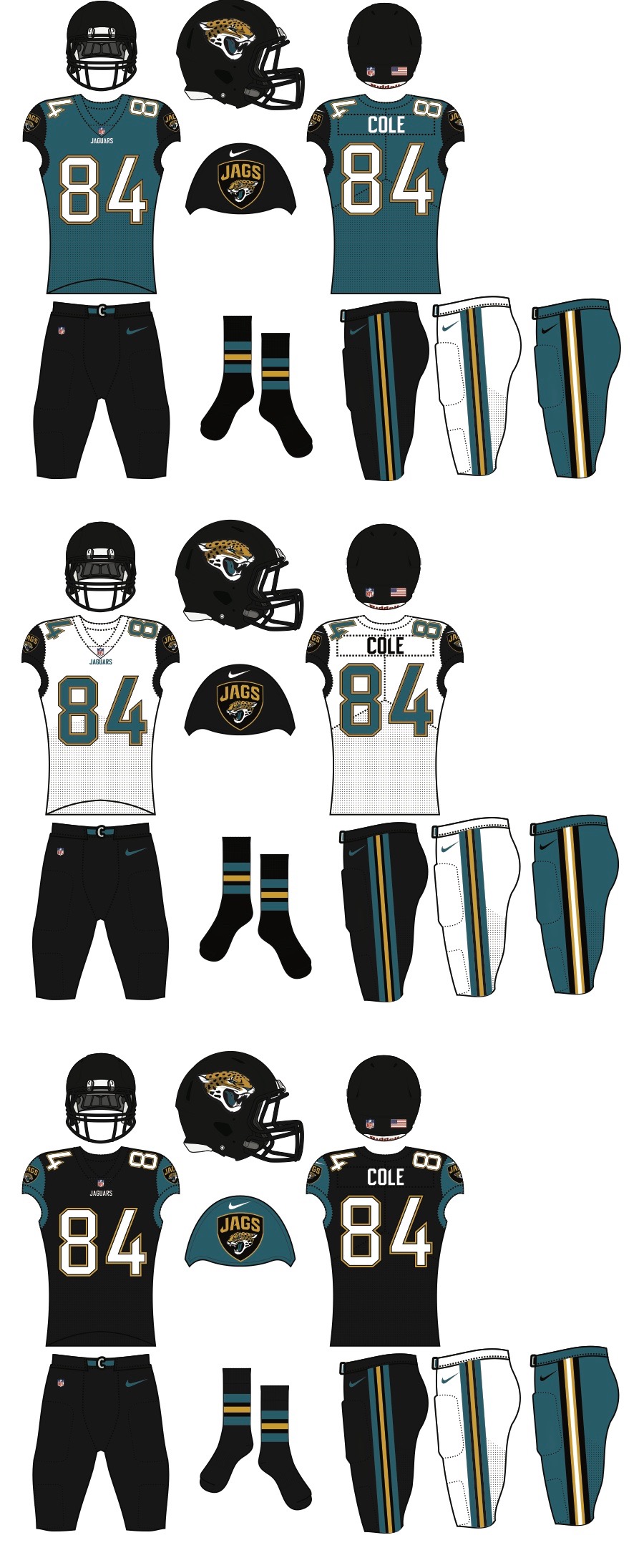
Nguyen kept some elements from the Jags' existing uniform set -- most notably the contrasting sleeves -- but got rid of the comic book elements like the two-tone helmet, the weird collar striping, the even weirder pants striping, and the unnecessary chest patch. The result is a fairly traditional-looking set that nonetheless feels just modern enough. (While we're at it, Nguyen also submitted a very attractive concept anchored by a gold helmet.)
Best Apple for the Teacher: Angus O'Keefe
Let's face it: If you want to suck up to your friendly uniform columnist and contest judge, you could do a lot worse than to include striped sleeves -- and especially striped socks. That's what O'Keefe did, and it's hard to argue with the results, especially with the dark teal metallic-flake helmet -- a nice touch. But hey, Angus, if you really want to end up as teacher's pet, you need to move those sock stripes up to calf level!
Want to see more? You can check out all of the entries we received here.
Paul Lukas would love to see the Jags go back to the uniforms they wore in the 1990s (more on that uni set here), but that probably isn't going to happen. If you like this column, you'll probably like his Uni Watch Blog, plus you can follow him on Twitter and Facebook and sign up for his mailing list so you'll always know when a new column has been posted. Want to learn about his Uni Watch Membership Program, check out his Uni Watch merchandise, or just ask him a question? Contact him here.