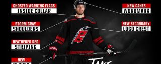
 After taking a one-year hiatus due to the NHL's changeover from Reebok to Adidas, NHL third jerseys are making a comeback for the 2018-19 season. And the Carolina Hurricanes are using theirs to more fully live up to their team name. That's the message of the team's newly unveiled alternate uniform, which features a new logo showing two square flags -- the symbol for a hurricane warning -- anchored to a hockey stick. The team's previous alternate jersey, which was in use from 2008 through 2017, featured a similar logo but with a single square flag. That's the symbol for a storm warning, not a hurricane warning, though. So the new design is a more literal expression of the team's name. "We've been discussing and working to create a new secondary logo for at least three years now, and part of that was taking the opportunity to finally upgrade to a true hurricane warning, which features two flags," said Mike Forman, the team's senior director of marketing and brand strategy. "We held off until this year to debut it, based on our ability to bring back third jerseys with Adidas and have it be the centerpiece of the uniform." 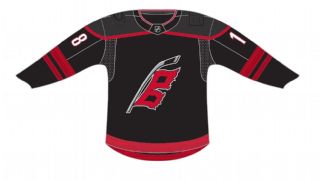 The uniform design, which is black with red stripes and a dark-gray shoulder yoke, was created by the Hurricanes' in-house creative team, not by Adidas. "Adidas assisted us in identifying the darkest gray material possible for the yoke and working with us on the heathered red stripes, which they originally designed and showcased in 2016 with the Team North America World Cup of Hockey uniforms," Forman said. "But the entire design was created internally." The unveiling also includes a new "Canes" wordmark -- with the two-flag warning symbol incorporated into the "C" -- that will appear on the team's helmets this season. As is often the case with uniform designs these days, this one tries a bit too hard with some of the details. The negative space between the two square flags, for example, is supposed to look like the shape of North Carolina, which feels like a bit of a stretch. Overall, though, this is a very solid design, and an improvement over the team's previous alternate uni. Grade: A Paul Lukas' favorite Hurricanes jersey is still this one. If you like this column, you'll probably like his Uni Watch Blog, plus you can follow him on Twitter and Facebook and sign up for his mailing list so you'll always know when a new column has been posted. Want to learn about his Uni Watch Membership Program, check out his Uni Watch merchandise or just ask him a question? Contact him here.
|